AnimalHouse Website Design
Google UX Design Professional Certificate
Design an AnimalHouse website to be user friendly by providing clear navigation and offering a fast animal reservation process.
The Goal:
Scroll ↓
Research
I conducted user interviews, which I then turned into empathy maps to better understand the target user and their needs. I discovered that many target users would like to have an quick and simple online reservation after visiting an animal shelter. However, many websites are overwhelming and confusing to navigate, which frustrated many target users. This caused a normally simple experience to become challenging for them, defeating the purpose of being quick and simple.
I created a user journey map of a users experience using the site to help identify possible pain points and improvement opportunities.
User Journey Map
Starting The Design
Difficulty with website navigation was a primary pain point for users, so I used that knowledge to create a sitemap.
My goal here was to make strategic information architecture decisions that would improve overall website navigation. The structure I chose was designed to make things simple and easy.
After creating the sitemap I moved onto creating basic digital wireframes for each screen in my app, keeping the user pain points about navigation, browsing, and reservation flow in mind.
Prioritizing useful button locations and visual element placement on the home page was a key part of my strategy.
During the initial design phase different screen size variations we also designed for primarily mobile users.
To create a low-fidelity prototype, I connected all of the screens involved in the primary user flow of reserving an animal for adoption.
At this point, I had received feedback on my designs from select group of people about things like placement of buttons and page organization. I made sure to listen to their feedback, and I implemented several suggestions in places that addressed user pain points.
Usability Study
An unmoderated usability study was conducted with five participants remotely from all the world that lasted 20 - 30 minutes.
Each participant was asked to follow the user flow for reserving a rescue animal online.
Refining The Design
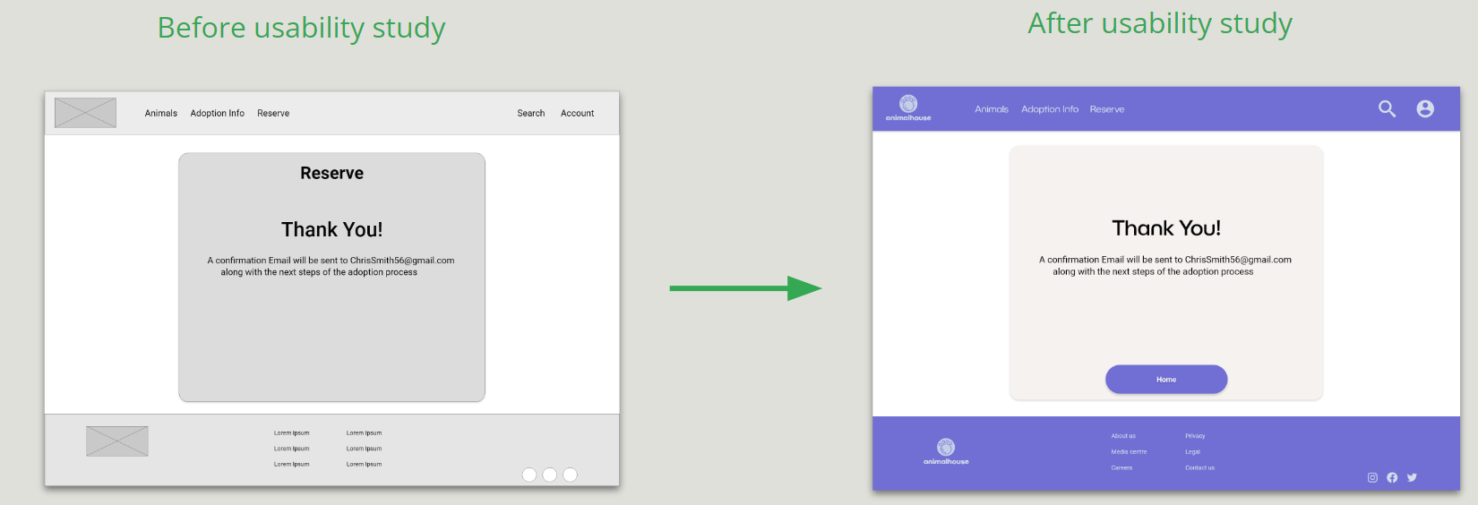
Based on the insights from the usability study, I made changes to improve the site’s reservation flow. One of the changes I made was adding the option to go back to the homepage once you finish submitting the reservation form. This allowed users more than one options to get back to the homepage especially where there current focus is.
To make the mobile navigation even easier for users, larger spacing between menu items was added as well as larger interaction boundaries.
My hi-fi prototype followed the same user flow as the lo-fi prototype, and included the design changes made after the usability study, as well as several changes suggested by members of a select few of testers.
View the AnimalHouse high-fidelity prototype
For further reading and information on this project please see the case study here: Animal House Case Study


